Whether you like to shop from your computer or mobile device, all websites are unique in some way. Most have common traits that make it easy to sign on, find what you want and check out. But, technology being what it is, there can be glitches and things that make it difficult from time to time.
This post is to help you with tips on navigating the website and finding what you want and need!
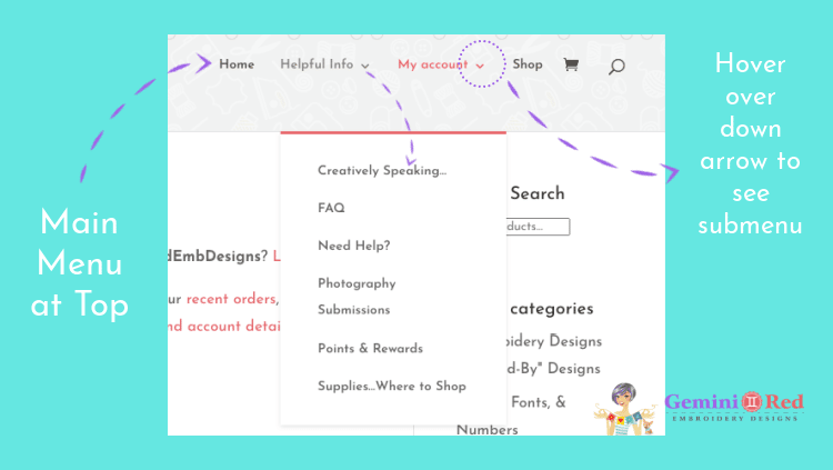
First stop, home page! On the home page you will find the main menu in the upper right corner. Whenever you see ‘Home’ you can click on it to take you back to the home / first page of the website. Hover over the down arrow next to Helpful Info and My account to access the submenus and more information. The image below will show you all the items you can access from the Helpful Info menu. Creatively Speaking is the blog which includes web versions of the newsletter, tips and tricks, announcements, information about new designs, and things you may have missed if you aren’t in the Facebook group! Check out the FAQs to answer many common questions and fill out the Need Help form if you are experiencing problems with the website, your orders, and more!
Did you know that you can submit your photos to be used on the website and social media and earn points you can apply toward furture purchases? Learn more by reading all about the points & rewards program! Lastly, find out where I shop and what my favorite supplies are by visiting the Supplies…Where to Shop page!
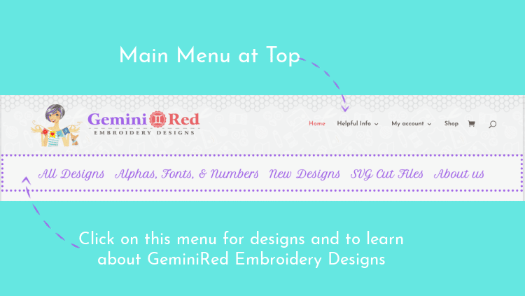
Looking for designs? There are many ways to search and shop! Below the main menu at the top, you will find a menu of design categories to quickly jump to a few top items as well as a link to the About Us. You can easily navigate to All Designs (there are over 3,000 that you can click through), Alphas, Fonts & Numbers (because let’s face it – we all love fonts!!), New Designs, and SVG Cut Files.
If you are using a mobile device, this menu will look different. You will see three (3) lines called a hamburger menu (yes, that’s a real technical term) because the website is optimized for viewing on a mobile device and it automatically condenses some of the data that is shown.
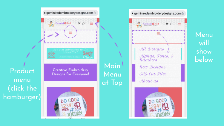
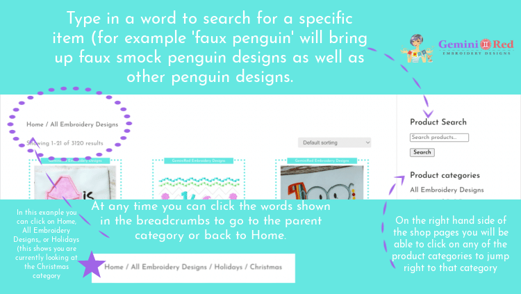
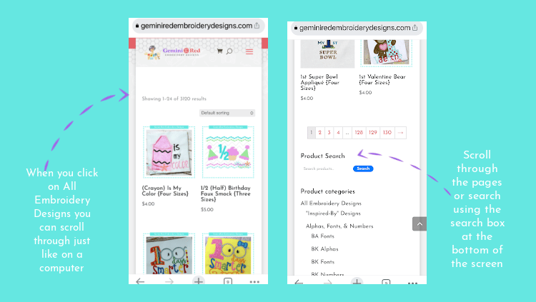
You can browse through the website on your computer or mobile device, however on your mobile device you will see everything in a vertical view instead of horizontal due to the screen size. On the home page you will see the top categories as well as the option to click on All Designs. Below you will see screenshots of how search options look on both a computer and a mobile device (I’m using an iPhone 12 Pro).
If you ever run into a problem and need some help, fill out the Need Help form and I will respond as soon as possible. My goal is for your shopping experience to be as easy as possible!
Thank you!
~heather